Are Dashboards Dead? Why We Built One Into an AI Chat Product
Dashboards are not dead, the passive one is. Why FUSE built a board into an AI chat product, what it kept from Looker Studio and how boards fit each workspace.
Are dashboards dead? No. The passive one is: the board you build once, forget to open, and that never says which number matters today. FUSE users asked for the opposite, something proactive for the mornings they did not know what to ask the AI. So we built a board that reads your Google accounts, gives every number a verdict, and turns into a question the moment you tap it.
Why an AI chat product needed a dashboard
A chat box is a great tool when you know the question. Many mornings you do not. You open FUSE, the cursor blinks, and the honest answer to "what should I ask?" is "whatever went wrong overnight, and I have no idea what that is."
That was the feedback, almost word for word. Customers liked the answers. What they wanted was a proactive experience: something that looks first and tells them where to dig, so the first question of the day is not a guess. A list of suggested questions helped a little, but a generic list cannot know that your paid clicks stopped turning into sessions on Tuesday.
So we built the thing a chat product is supposed to make obsolete. We built a dashboard.
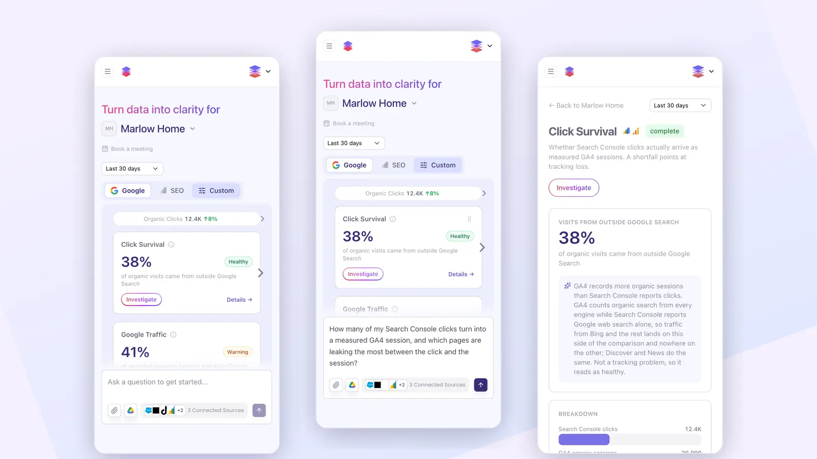
Twenty-three seconds on a phone: the Google board, the SEO board, a tap on Investigate, the question written for you, and the reporting behind the number.
The passive dashboard is dying, not the dashboard
Every few months someone declares the dashboard dead. HFS Research called them "relics of a bygone era." Databricks put it sharpest: a dashboard is a fixed question, asked over and over, with new data plugged in. The question never changes.
They have a point, but the headline is wrong. There are two jobs hiding inside the word "dashboard," and only one is in trouble.
The first job is monitoring. Everyone looks at the same picture at the same time: the weekly revenue review, the month-end check. This job is alive and well, and a chatbot is worse at it. You want the same number in the same spot every Monday, not a fresh answer that drifts.
The second job is investigation. A number moves and someone has to find out why. That work almost never happens on the dashboard. It spills into spreadsheets, email threads and a meeting that eats an afternoon.
The dashboard that is dying is the one built for the second job but equipped only for the first. It shows the what and never the why. About 25% of employees actively use the business intelligence tools their company pays for, and that figure has barely moved in seven years, according to BARC and Eckerson. You may have seen a scarier number, "60 to 70% of dashboards go unused, per Gartner." Do not repeat it. It traces back to a social post, not a Gartner publication. The honest figure is bad enough.
What we kept from the Looker Studio board
Almost every marketing team has the same board somewhere, usually in Looker Studio: Google Ads, GA4 and Search Console on one page, a date picker at the top, a row of headline numbers, a few trend charts. There is nothing wrong with it. The sources are the right sources and the layout is familiar to everyone who has ever run a campaign.
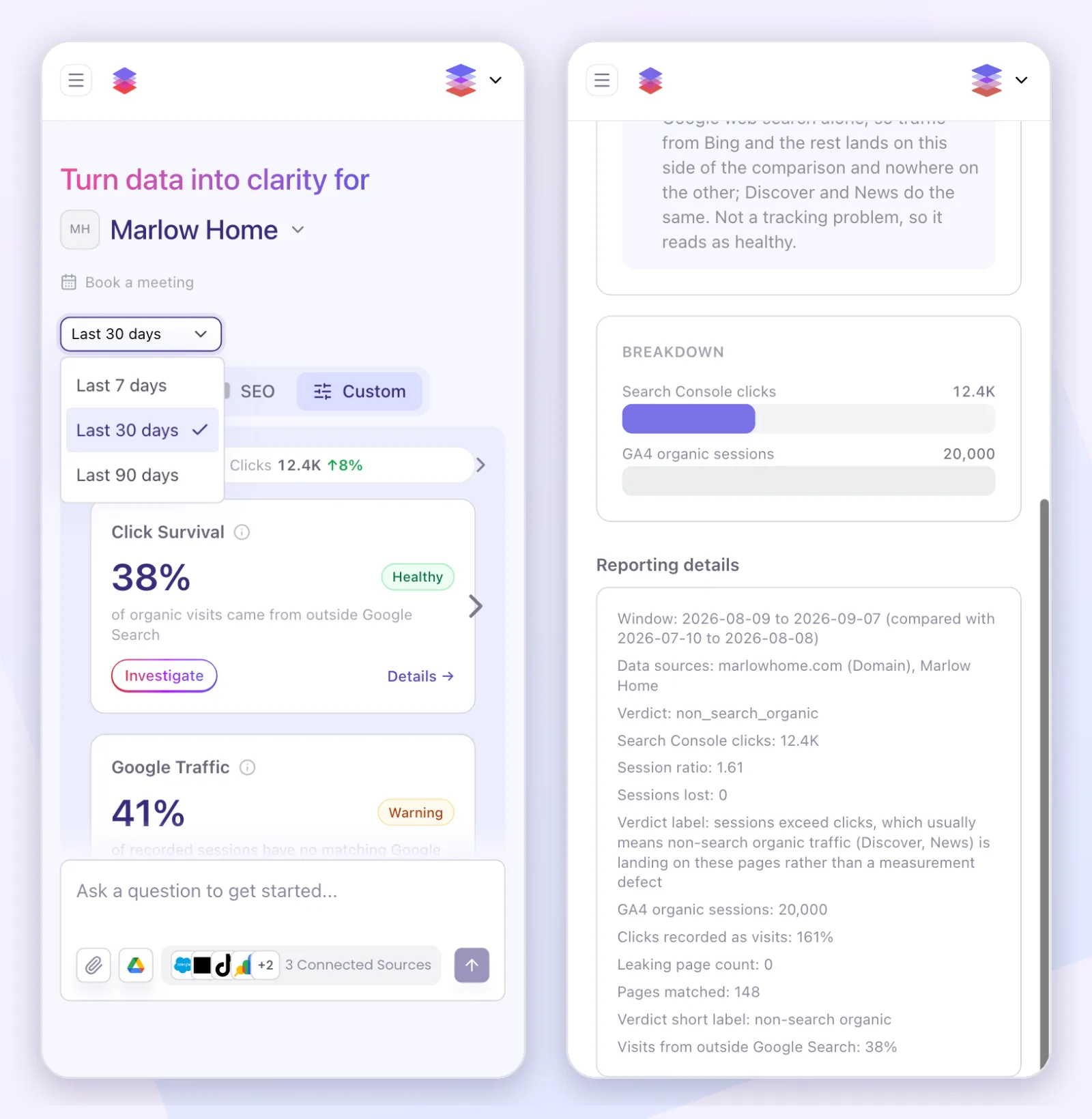
So we kept the shape. The FUSE board reads the same three Google accounts. It has a strip of headline numbers along the top, a date range of the last 7, 30 or 90 days with 30 as the default, and the same numbers waiting on every open. It lives on the chat welcome screen, so it is the first thing you see, not a page you have to remember to visit.
One honest trade-off before going further. If what you need is pixel-level control over every chart, Looker Studio is still the better tool, and it is free. The FUSE board is not a chart builder. It is a set of questions we chose to ask on your behalf.
Every card carries a verdict, not just a number
Here is the part the Looker Studio board never did. Each card on the FUSE board is a question, and the number on it comes with an answer.
Take a card called Click Survival. It compares the clicks Search Console reports with the organic sessions GA4 records, because a gap between the two usually means tracking is losing visitors. On a demo workspace it reads 38% of organic visits came from outside Google Search, with a green Healthy chip. A board that colors by direction would have flagged the mismatch as a problem. FUSE explains why it is not: GA4 counts organic search from every engine while Search Console reports Google web search alone, so visits from Bing, Discover and News land on one side of the comparison and nowhere on the other. Not a tracking problem, so it reads as healthy.
Next to it, Google Traffic shows 41% of recorded sessions with no matching Google click, and that one wears a yellow Warning chip. Two cards, two numbers, two different meanings, and the colors already tell the story before you read a word.
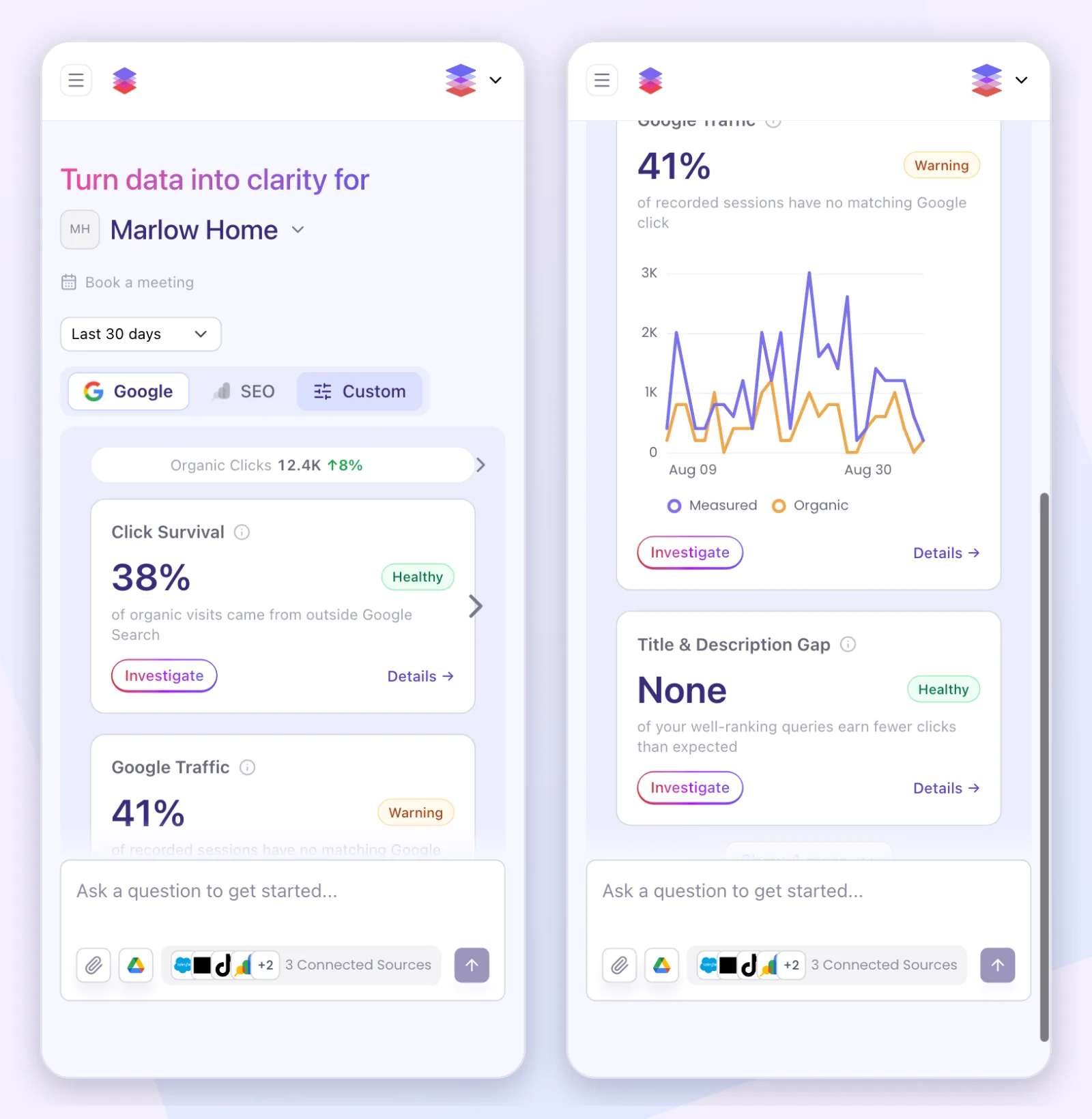
Tap a number and FUSE starts asking why
When a card catches your eye, tap Investigate. The card's question flies into the chat box, already written. For Click Survival it reads: "How many of my Search Console clicks turn into a measured GA4 session, and which pages are leaking the most between the click and the session?" Send it and FUSE goes to work on the live accounts. You go from noticing to investigating without switching tools, exporting anything, or booking a call.
Tap Details instead and you get the long version of the card: the headline, the breakdown behind it, and a reporting section that spells out the window measured, the period it was compared with, and which accounts fed it. If you want to know how FUSE reaches those accounts to answer the follow-up, we wrote that up in connecting Claude to your marketing data.
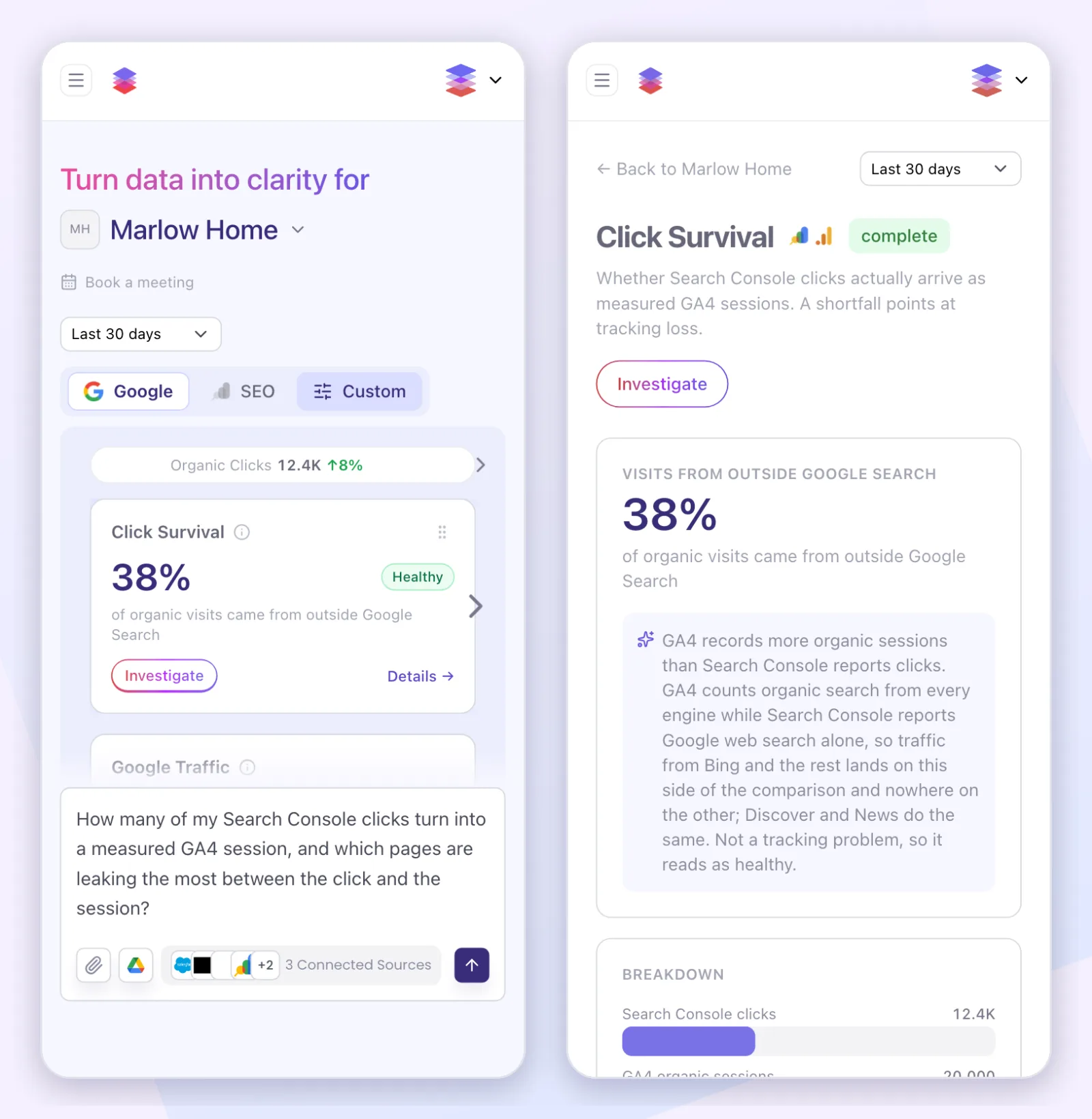
The SEO board reads your rankings the same way
The second tab is the SEO board. It combines Search Console with ranking data from a search data provider and asks the questions an SEO lead would ask on a Monday. AI Search Exposure reports the share of your estimated organic visits that come from searches showing an AI Overview. On the demo workspace that is 71%, with a Warning chip, because those are the visits most at risk of never clicking. Page-One Visibility Trend tracks how many of your ranked keywords sit on page one, and Estimated Traffic Trend shows the monthly organic visits your current rankings earn.
Every one of those cards has the same Investigate button and the same detail page as the Google cards.
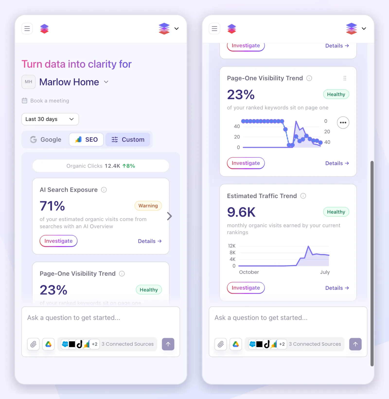
Each board is built for its workspace
This is where the word "custom" earns its place, and it is worth being precise about what it means today.
The cards on a board depend on what that workspace has connected. A workspace with only Search Console gets a different layout from one with Search Console, Google Ads and GA4 together, and we author each of those layouts by hand rather than showing empty cards for accounts you never connected. An agency with a workspace per client sees a board shaped by each client's accounts, not one template with gaps in it.
Within a board, you can drag cards into the order that matches how you work, and change the date range for every card at once. The third tab, Custom, is where we build boards around an account's own questions: a card for the metric your monthly report is judged on, or a comparison your team argues about every quarter. Today that starts with a conversation with us rather than a drag-and-drop editor, and the tab says so.
The numbers are rebuilt every night. If you open a board whose numbers have gone stale, FUSE shows what it has and refreshes in the background, and the chat box is never locked while it does.
It also runs on your phone. Every screenshot in this post was taken at phone size on a demo workspace, because the analysis that created the FUSE mobile beta showed us how many people arrive that way.
The honest limits of both sides
The board is the Google view. It reads Google Ads, GA4 and Search Console, plus the ranking data behind the SEO tab. Meta, TikTok, Klaviyo, Shopify and Salesforce are not on it. You ask about those in the chat, and the answers come from the same connected accounts.
The people who say "just replace it all with AI" are wrong too. A dashboard number is fixed: the same question returns the same number every time. An AI answer can vary, and it can state a wrong number with total confidence. As Donald Farmer put it, "I'd rather have a metric that's visibly wrong than one that's confidently wrong."
So keep the monitoring layer. It is the thing you check every week, and it should not surprise you. Put investigation on top, because that is the job an open-ended tool does better. FUSE answers are built from live data pulled directly from your connected platforms through their official APIs, not from a model's memory. Every analytical response traces back to a recorded tool call. If you are still choosing that tool, our 2026 guide to AI marketing tools is the place to start.
Questions we get
Are dashboards dead?
Dashboards are not dead. The passive dashboard is dying: the one you build yourself, have to remember to open, and that shows a wall of numbers without saying which one changed or why. The shared weekly monitoring view is alive and well, and an AI chat is worse at that particular job.
Why did FUSE add a dashboard to an AI chat product?
FUSE added a dashboard because customers asked for a proactive experience. Chat works when you know the question, and many mornings you do not. The board looks first, gives every number a verdict, and turns into a written question when you tap it, so the first question of the day is never a guess.
Which accounts does the FUSE dashboard show?
The FUSE dashboard shows Google Ads, GA4 and Google Search Console on the Google tab, and Search Console plus ranking data on the SEO tab. Meta, TikTok, Klaviyo, Shopify and Salesforce are not on the board yet. You can ask about all of them in the chat.
Can the FUSE dashboard be customized for my account?
The FUSE dashboard is shaped by each workspace: the cards depend on which Google accounts are connected, you can reorder them and change the date range, and the Custom tab is where we build boards around an account's own questions. Custom boards start with a conversation with us, not a self-serve editor.